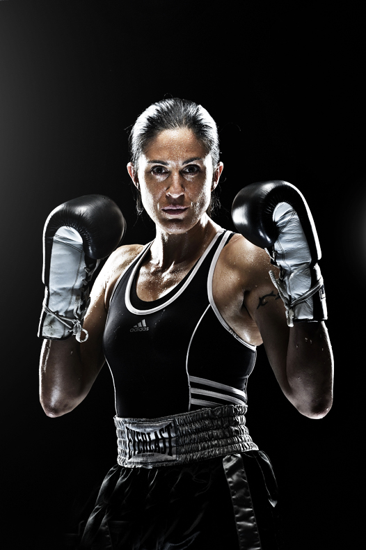
Got a good class here in Santa Fe. We started rocking and rolling yesterday, just examining light shaping tools, exposure differences, control of light, both with big and small flash. As I said during the day, we shoulda all been arrested, ’cause we were having too much damned fun. Professional boxer Clara de la Torre came in to be our demo model. It was cool. We did some pretty simple, straightforward umbrella stuff, and then decided to head in the direction of bad ass light.
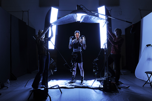
I’ve messed around with this type of light before, which is pretty ideal for athletic bodies. Thing is, I mostly have done it with small flash. For this, we kinda went gaga, and mixed 3 different light sources. The main overhead is an Elinchrom Ranger plugged into a beauty dish. It is, as you see, table topped over Clara, coming right down on her, shading her eyes, making her look like she belongs in the movie poster for Goodfellas. Then in the background, we got identical strip lights going, both running off Quadra packs and heads. Right down at her knees are two SB900 units, banging into a silver Lastolite reflector sheet. Then, in front of her, and low, is another SB900, zoomed to 200mm to tighten the light spill, and further concentrated by a Honl 1/8th inch grid. On top of the grid I layered some gaffer tape, to cut the light down to a super specific spot, i.e., Clara’s eyes. Then of course I drove Dustin and Sarah, the studio assistants, completely nuts by having them edge down the spill of the beauty dish with hand held tri-grip solids. As you can see, they took that puppy down to basically a sliver of light. Sarah’s side is more completely flagged. Dustin kinda screwed his side up:-)
Then, I opened that Pandora’s Box known as Photoshop, which to me is like a large, ornate mansion with about 75 rooms and 15 bathrooms. I’m standing in the lobby, looking for luggage assistance. But, here’s the great thing about the internet. I hit one of my stored Strobist links and voila! I got a path to follow in PS. DH has a detailed high pass layer deal in there that is simple but pretty cool. Naturally, like a kid with a new toy, I went Nike on the file, and got the top result. The file outta the camera is below, after dropping a black point. Of course in the original file, there’s my Honl grid, poking into the bottom edge. Didn’t bother me too much, it being in a dark area. Rather have the light where I want it in this instance, than pull back and lose some of the snap and concentration in the face.
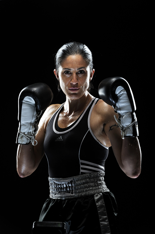
Did I overdo it? Dunno? I’d love to hear if you love it/hate it. The light of course, was what I was after during the demo. Really liked the feel of the strips. Nice and smooth for the rim. Did this on previous occasions with mutliple small flashes serving as the backlight, triggered again by an overhead beauty dish. Got the below, which is nice, but as you can see, the rim light effect is a touch more splashy and uneven, due to the smaller sources.
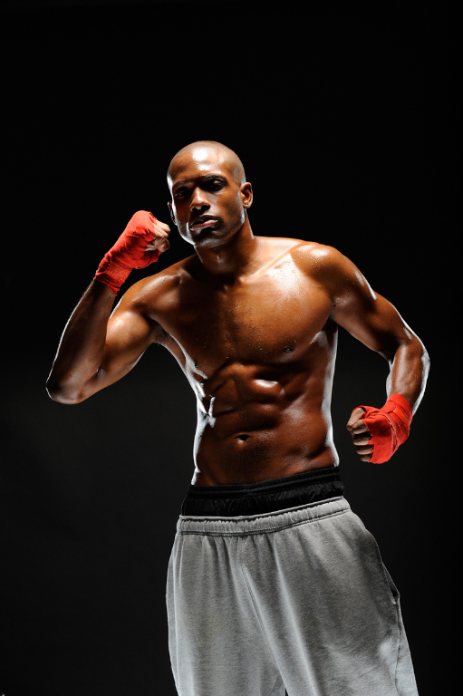
This is also done without the benefit of the low, frontal, gridded SB unit, hence really nothing in the eyes. This is Aaron, who’s been on the blog before and is a supremely capable athlete. This iteration of this style light was just about attitude and physicality, and not dedicated to seeing eyes and facial detail. More tk….











Doesn’t it make you feel kinda inadequate working around these super-fit types. It does me;-)
Personally, I like it. Yes, very Nike-like, but as you say, it works for the subject. I also like to see the sheet she’s standing on for the bounce effect. Like a magician revealing the prestige….
Love it.
Beautiful stuff. The expression of the two talents and your lights just make everything look so perfect.
Joe,
I love this kind of lighting, and want to learn from your wonderful style.
Thanks for help. Love the dramatic effect
Ken in KY
I like it fine! That’s my vote.
I love the look you’ve got going on here. Nice to be able to follow the way you went about lighting. If you’ve overdone it? Well, personally I think you could have gone even further (not to say I don’t like the look as is). Have a look at Tim Tadder’s work if you’re inclined to take it seriously down the bad ass road.
That image of Clara after the edits in PS – the transformation is stunning.. very “metallic”, powerful image. Quite amazed at the final output and would like to see more of these Joe.
I don’t know Joe, you made Clara look beautiful and that may some type of infraction of bowing rules 😉 Her eyes really drew me in, so I have to say that I love the bottom shot of her. But is that the top of a SB 900 at the bottom of pix?
I actually like the PS version a lot. It has edge, it has light and darkness where it needs. Of course the original image was a great place to start with, but that’s where mortals like us need to thrive! The hard light is simply amazing on these athletes! If I could rant just one thing, I would burn the halo of light on the left of the PS version.
Other than that… I envy Nikon 200mm strobists! 🙂
I take it y’all have seen the new Wheaties Fuel cereal? Instead of a picture of a bowl of cereal, the box fronts carry strong photos of athletes in a very similar style to this… guess it’s an idea whose time has come!
I don’t think the high pass is overcooked but I do think those side banks are maybe a bit hot and could be a bit softer. Joel Grimes’ (www.joelgrimes.com) shots have the kind of feel I’m thinking of.
But I do look the setup a lot either way.
Loving both shots, as usual!
Aaron’s picture appeals to me more personally, but then again – they’re two totally different looks. He’s got the more graphic pose + a lot more negative space to settle into.
I guess you could’ve lowered the hp filter’s opacity a tad or masked off some of her face – the final result leaves her looking a little masculine, which is not nearly as evident in the second pic.
Anyway, great shots & glad to hear you had a blast!
Man, change nothing if your posting what you decided at setup time. I totally agree with the dark ‘bad azz’ eyes you have acomplished.
One idea that pops into my head is to have the lady flex her muscles like the male. She appears a little relaxed?
I love the lighting. I think it highlighted her to look both strong and yet she did not get terribly angular or harsh.
Thank’s again to share your work with us !!!
Joe, to me, these High Pass filter shots are like HDRs– when I see the photo for the first time, it’s like “Wow…cool” but after I see it over and over again it starts to look too artificial and I tend to like the original better. That’s why I guess it makes sense on Gatorade or Nike print ads where you want the initial impact, but for my personal archives, I’ll stick to the originals. Thanks for the interesting blog entry…
I Love it! This is very original
Joe,
I actually like the High Pass filter on this particular photo. Makes it just a bit more edgy, which goes right along with the light, yet not overdone.
All the best,
Stephen
Great post. I especially like the comparison between doing this with strips and SBs.
Hey Joe,
Absolutely love the photographs; the lighting is simply perfect for the model and what she stands for!
I really must get out to the Santa Fe Workshops; geez 2011 could be expensive, I mean a good investment…lol First the GPP followed by Santa Fe; still it’s all in the name of ‘education’.
Thanks for a great post and a great breakdown of the lighting.
All the best to you,
Glyn
Joe – I love the photo of Clara. I don’t think it’s overdone at all. In fact, I think you nailed the drama with the lighting. Harsh in the right spots, spot-on in the perfect spots. Great work as always!
I did something kind of similar some days back, albeit without a boxer! 😀
http://www.flickr.com/photos/rajarshi/4398187420/
Extra Extra, read all about it, “McNally uses Photoshop, no sign of the apocalypse!”
Fantastic image, love the setup shot as well.
Thanks again Joe for the blog and all the great info that you share.
Awesome as always!! I’m in your class for Santa Fe for the first week of August…Can’t wait!!
So, was the kool-aid good? Honestly though, the use of the HIGH PASS works at it’s best when used with the lighting you used. ie: the striplights on both sides. Your additional touches of the silver floor/sb-900’s and the cutting down the spill from the beauty dish AND the spot on her face/forehead give it that extra (no pun intended here) punch that we have learned to expect from a lighting pro as yourself. One thing does stand out though, the bad clone job on her shorts from where you took out the HONI head.
Not a bad trudge this time either…thanks for that, kg
I am lovin the high pass look – but I think I appreciate it more on the clothing and shorts more than her face… maybe toned down a bit – not gone and missing – but just a bit less intense since there’s already great detail on her skin. IMHO.
Joe- Quick Tip: You don’t have to use ‘Hard Light’ when doing sharpening like that. Often ‘Soft Light’ or ‘Overlay’ give you a less drastic effect that’s not as obvious.
Joe, love your work. Doesn’t seem like you over did it with the high pass filter. Maybe I can’t tell because I’m not viewing it at 100% but they look great even straight from the camera.
I attempted a similar shoot a couple of weeks ago with small flash. 2 flashes with Honl Speed Grids for side lights and a flash in a 28″ Soft box or 60″ reflective umbrella for the front. I used the same DH HP filter technique. Easy to go overboard, but it can look really good.
http://davemphotography.blogspot.com/2010/03/photographys-dirty-little-secret-davem.html
LOVE it. In my opinion, the SOOC file looks perfectly fine. The HP filter just gives it that extra edge and suits the lighting perfectly, if you ask me. Well done!
Do I like it? Yup, especially the rim lighting on her arms up beyond the tops of her gloves, the shine on her hair, and the shine/highlight that outlines her shape. That says “don’t mess with me, but don’t misunderstand, I’m a woman”. Great pose and great intensity in her eyes, too. Nice! Will we see this on the SI cover? If not, we should.
Joe,
The high pass works here, and I suddenly have this thirst for Gatorade. I think it’s a really cool effect, even when the filter is so pronounced. It isn’t until every shot in someone’s catalog has it that I get annoyed.
“… and then decided to head in the direction of BAD ASS light.” (I thought that was the only direction ?) The set up is serious and the lighting is, as always, looking rad. Dare I say that you’ve got some real … BADASSITY ?!
Great shots, I think the post works if your going for the grunge commercial layout. Thanks for the insight to the light.
Robert
Beautiful shot as always Joe!
Fred
I like the shot Joe! I wouldn’t say you over did it with the high pass technique. For a simple portrait like in David’s article it may be a bit much, but it adds a great edge to a sports shot like this, and makes her look more “rough cut” and intimidating (I wouldn’t want to mess with her, that’s for sure).
Love it. Works great for the boxer. It’s a matter of taste and situation. Some brides might like it as well!?!
Marvelous! I am glad you didn’t went Adidas with the file.
Love it! usually too much salt for my taste but it realy works well for the subject.
I can’t believe that there is not a single comment yet. Joe you nailed it as always. The first shot is just outstanding, and something that I have never seen here before. I’m glad you decided to give it a try in PS. One small step at a time huh? 🙂
It’s also done very accurate. Looking at the first photo only I wouldn’t be able to tell that it was improved in PS, even though I watched a very similar tutorial on Scott Kelby’s blog (sharpening by invert blur).
Than again looking at it makes me regret that I’m not one of your assistance. Hope that some of it will appear on Kelby Training videos soon 🙂
Best Regards
Bartek
I think the high pass effect works very well with the subject matter.
That being said I would have toned it down on her face just a little bit.
Great shots Joe, thanks for sharing.
It always nice to see before and after post processing photos. I would like to see more of these.
Oh my God, Joe using Photoshop- we’re at the threshold of a whole new era. 😉
I like the effect but I like the original better. I have always admired the way you get it right in the camera first! Great stuff!
Cool setup. The high pass looks great on her clothes/equipment. I probably would have masked out her skin/face and left it a little softer. Mainly on her face though. High pass looks OK to me on her upper body.
Does the height of the EL Strip give much advantage here vs the less expensive 20×51″ or 14×35″ strips? I know the ELs are thinner… maybe easier to control the spill when used as rim lights.
I like the original one a bit better to be honest… Looks more real. Both are stunning images though. And thanks for the setup shot/info. Love your work!
Joe,
Fantastic shot! Thanks for sharing so precisely the light set up – quite a complicated contraption by my standards!
The post-processing really did lift up the photo – it really pops to my eyes now!
Well done,
Blaise
I really like the first one. . .The second one. . .it almost looks like you sharpened the picture a little too much. idk what I think about it. Amazing stuff like always
Joe, really liked the high pass version. And, I am further encouraged to mixing light sources. Many thanks and, welcome back to the blog. Hope to see you again soon. Charles…
Although your napkin doodles of setups are nice, the pullback shot really explains it all. Give us more of that!
Wow – the grid on the face adds a lot. I’m pretty sure I would want to avoid bumping into either of these athletes in a dark alley.
Two words… Bad Ass. Dustin-wtf? Just kidding. Very powerful. I truly enjoy learning from your work. Thanks 😀
Love your work Joe – always inspiring. In fact you’ve inspired me to try something similar with a bunch of portraits for a local football team I’m about to shoot, all be it with a little less lighting power & experience. Just think it might give them something a bit different to the usual safe/soft portraits they’ve had in previous years.
Thanks, Simon
Joe, why not consider a class on this type of lighting to go with the others on kelbytraining?
Great post Joe.
I’m curious about the source of the highlights under her nose. Is that from the gridded sb900?
Also I’d love to see a larger version of your setup shot. But lovely processing. I dig it.
Whats with the black arms? I guess she’s wearing something…? hard to see from here.
Last one is a bit too artificial – like climbing a mountain.
Prefer the first one.
Joe,
If you would shoot a dog shit on a sidewalk, I would hang it on my wall…
The side side of it is – it doesn’t screem Joe McNally…
Maybe highlighs are a bit over the top…
Maybe it’s asking for an HDR background?
I wish you came to France one day. How about a workshop in Paris?
Another great shot. The picture of your setting is very helpful, but I like your lighting drawings even more. I miss the “Mumnuts” on the pic…
Great job Joe, didn’t over do it at all in my opinion. The models do look bad-ass.
Definately like it, great picture, I am doing some sports pictures soon and inspired me to have a go a getting something similar.
Its great to have your newsletter, its very inspiring to open my mail and find this wonderfull masterclasses. Thanks.
By the way, great shots.. Excelente!
You definitely didn’t overdue it. The photo is awesome!
Personally, I’m a bit disappointed. Technical virtuosity — sure enough. But what are the images saying to us? Do I think that they would make great posters on some young teenager’s wall — sure enough. As Duchemin said, it’s about the vision not the gear. Is our gear now just SB900 speedlights and Rangers, and this is what we are glorifying? What is Joe trying to say? What is revealed about the subjects? Or are these just pretty posters on some teenagers wall?
Not badass lighting, just bad lighting. Fifty years from now people will look back and ask “what were they thinking?”
I like both the shots but what I think is the most important thing is what she thought and which one she felt was a true expression of her
I am learning everyday from you sir it is a pleasure to once again view one of your photo’s it not over done.. I love your books as well. I also wish you could take some time and make a few more video’s that way I can watch them over and over as i have done with the last one you did. I think I have watched it now about 60 times.Thanks.. Really enjoy your work…
awesome shots. so jealous of the folks in the workshop! still mulling over stuff learned at last year’s workshop. btw, is that one of the Avett Brothers assisting with the reflector?
Absolutely love it! I remember Aaron from Dobbs Ferry workshops – it was very cold and we got only 1 shot per person ‘coz Aaron was freezing – at least that what Lynn thought 🙂
Fantastic picture straight off the camera – you’re the master of light!
ooh btw: strobist site is down today – did you do it Joe? 😀
The more I look at the two shots (and I prefer the second one) the more that two things become very apparent.
Firsly is the skin tone around the elbows on the female shot. It looks like a bit more front fill is needed in these areas as the skin tones feel discontinous around here.
And secondly, in both shots I think you can lose 50% of the black space above the head in each. Feels a little strange compositionally in both shots. Gives the appearance that the subject is falling through the bottom of the frame or being oppressed by the heavy top weight of black space. In both cases it makes the subject more diminutive and detracts from the facial expression as a focal point as you mentioned you were trying to emphasise.
Super powerful images! I’m curious to know about your camera settings as well – did you intentionally go for a deeper depth of field, or shallow?
I agree that there is a bit of a color tone issue on her arms (that doesn’t necessarily appear on his); not sure what that’s about.
Also, how many images did you shoot overall through the day?
Wicked , Just Wicked 🙂
Joe good job but man your getting a bit sloppy there or in a rush that left side shoulder is a bit blown out… Maybe you were in a rush or something… Subject had 5 min for you to do your job or something.. Love the blog and I am just giving you a bit of hard time… “The old days of Chrome” you would have lost that whole shoulder..
@John (March 17, 9:25am) – I’m a little late to this conversation, just walked in the door from Seattle. Was amused to see my name here, so thought I’d reply. I agree with your sentiments, but you also have to keep in mind a couple things: the first is that Joe probably does too. Joe wrote the forward to my first book and while he can geek out with the best of them, Joe is first a storyteller and if you put him in the middle of something with only a camera and a lens, or you give him a truck full of SB-900s, he will look first for the moment and the heart of the story in the way he always has.
The second is more relevant. This was shot in a workshop setting. He lights, because that’s what he’s teaching, he shoots a couple frames, he lets others do the same and moves on. So in this context, Joe isn’t discovering and expressing vision in the same way. He’s teaching. And what he’s teaching is one piece of the visual language his students will later move on to combine with others.
In the end this is just a portrait with some cool lights. That’s all it was meant to be. Give Joe time to create something that he’s passionate about, and in a context where his job is to be a photographer creating his own work and not a teacher focused on his students, and his work would be different. Joe is a gifted photographer and a gifted teacher and the gifted teacher knows it’s not his job while teaching to express his vision but instead to help his handful of students learn the tools to find and express theirs.
A blog is a funny beast, you have to be transparent and so you put stuff up to say here’s what’s going on, not to showcase your best work. That’s part of what makes Joe’s voice unique in the photography community, he doesn’t shy from showing stuff he might not show otherwise, in hopes that we can all learn and stay connected.
Anyways, wow, I just wanted to chime in and it turned into a sermon. Sorry about that. Short version, Joe gets it, he knows it’s not about the gear, but teaching contexts like this, and especially the blog, can make it seem otherwise.
Side note, Joe: I noticed you replaced the image. 🙂 The first one I saw had a light in the frame at crotch level. Glad you decided to clone that baby out 🙂 Fancy lighting or none, I’m pretty sure your intention (vision) for the image was not to document the growing problem of boxers with a case of crotch-light.
Hey David! many thanks for your comments…. .eloquent as always.
Oh, and I light crotches with the best of ’em!
Joe
I like the lighting approach (and thanks, as ever, for sharing), IMVHO there is a bit too much space over the boxer’s head, and the sweat beads on her face are too sharpened (is that a phrase??)for my taste. Actually, staring some more at these pictures I think I prefer the lower of the two – the slightly darker face encourages me to look longer and engage with the subject, look around her more. Tx, Matt.
nice, I really appreciate your work
Oh man I’m laughing, what is this now- “Teach Poor Joe How to Shoot” blog or something?
Joe, if your cats could comment here, what would they say?
Joe, enjoyed as usual. Great shots, I prefer the first one also. Keep up the great work.
Love the work. Thanks for so much detail.
Just wanted to thank you for the way you photograph women. Dancers, boxers… you always show off their strength. Thank you for doing that.
Joe,
I love using side lighting for highlighting the body features of athletes. This also works great for shooting fine art nudes. I am curious about the reflectors on the top of the boxer, is this to ansure an even rim light?
Thanks in advance and greetings from Sao Paulo.
Hey Joe (sorry, I couldn’t resist). You must be goin 180 mph all the time. Love your work. Allow me one question, thought: Wouldn’t it be easier to achieve that effect with a standard reflector and barnddors instead of the beauty dish?
Werner
and on the final version there’s quite alot of light flare on the left side (her right)….but wait….this sin’t a “real” shoot for a client right? it was just a quick shoot n go for a clinic right? and the photoshop done on it isn’t anything near as you would turn over to a client as a final image…right?
Hey Joe
Love the 1st shot of Clara … what drama !
Missed your Hot Shoe Diaries Workshop back in K.Lumpur due to a hopelessly long wait-list. Made it for your Let There Be Light Seminar after a 4hrs drive. Went on to read The Hot Shoe Diaries, The Moment It Clicks & subscribed to Kelby Training.
With all that, here’s what I’ve got.
http://www.modelmayhem.com/portfolio/pic/16869242
My way of working with flash has been completely overhauled.
Thank you & regards from Malaysia.
Love the photo! Got both your books too and they’re great.
But… sfter you mentioned editing out the flash from the bottom left the clone becomes really obvious, the two pieces of material with exactly ythe same creases. And I agree with another poster above that the color of the lower arms justr looks wrong. Maybe the reflector was coloring it, or the flashes have different temps?
Wow…love the lighting.
The picture that I think is a true reflection of me (in answer to George Paganini’s comment)is: both. The original = a true reflection in a portrait sort of way. The PS version = a true reflection in the Pro Boxing “fight poster” (or movie poster) sort of way.
Thanks Joe, and everyone else, for a fun class! I think I enjoyed watching everyone learn about lighting as much as I enjoyed being the model.
Wow I love this kind of lighting!
Write more, thats all I have to say. Literally, it seems as though you relied on the video to make your
point. You obviously know what youre talking about, why waste your intelligence
on just posting videos to your site when you could be giving us something enlightening to read?