var gform;gform||(document.addEventListener("gform_main_scripts_loaded",function(){gform.scriptsLoaded=!0}),window.addEventListener("DOMContentLoaded",function(){gform.domLoaded=!0}),gform={domLoaded:!1,scriptsLoaded:!1,initializeOnLoaded:function(o){gform.domLoaded&&gform.scriptsLoaded?o():!gform.domLoaded&&gform.scriptsLoaded?window.addEventListener("DOMContentLoaded",o):document.addEventListener("gform_main_scripts_loaded",o)},hooks:{action:{},filter:{}},addAction:function(o,n,r,t){gform.addHook("action",o,n,r,t)},addFilter:function(o,n,r,t){gform.addHook("filter",o,n,r,t)},doAction:function(o){gform.doHook("action",o,arguments)},applyFilters:function(o){return gform.doHook("filter",o,arguments)},removeAction:function(o,n){gform.removeHook("action",o,n)},removeFilter:function(o,n,r){gform.removeHook("filter",o,n,r)},addHook:function(o,n,r,t,i){null==gform.hooks[o][n]&&(gform.hooks[o][n]=[]);var e=gform.hooks[o][n];null==i&&(i=n+"_"+e.length),gform.hooks[o][n].push({tag:i,callable:r,priority:t=null==t?10:t})},doHook:function(n,o,r){var t;if(r=Array.prototype.slice.call(r,1),null!=gform.hooks[n][o]&&((o=gform.hooks[n][o]).sort(function(o,n){return o.priority-n.priority}),o.forEach(function(o){"function"!=typeof(t=o.callable)&&(t=window[t]),"action"==n?t.apply(null,r):r[0]=t.apply(null,r)})),"filter"==n)return r[0]},removeHook:function(o,n,t,i){var r;null!=gform.hooks[o][n]&&(r=(r=gform.hooks[o][n]).filter(function(o,n,r){return!!(null!=i&&i!=o.tag||null!=t&&t!=o.priority)}),gform.hooks[o][n]=r)}});
/* = 0;if(!is_postback){return;}var form_content = jQuery(this).contents().find('#gform_wrapper_1');var is_confirmation = jQuery(this).contents().find('#gform_confirmation_wrapper_1').length > 0;var is_redirect = contents.indexOf('gformRedirect(){') >= 0;var is_form = form_content.length > 0 && ! is_redirect && ! is_confirmation;var mt = parseInt(jQuery('html').css('margin-top'), 10) + parseInt(jQuery('body').css('margin-top'), 10) + 100;if(is_form){jQuery('#gform_wrapper_1').html(form_content.html());if(form_content.hasClass('gform_validation_error')){jQuery('#gform_wrapper_1').addClass('gform_validation_error');} else {jQuery('#gform_wrapper_1').removeClass('gform_validation_error');}setTimeout( function() { /* delay the scroll by 50 milliseconds to fix a bug in chrome */ }, 50 );if(window['gformInitDatepicker']) {gformInitDatepicker();}if(window['gformInitPriceFields']) {gformInitPriceFields();}var current_page = jQuery('#gform_source_page_number_1').val();gformInitSpinner( 1, 'https://joemcnally.com/wp-content/plugins/gravityforms/images/spinner.svg', true );jQuery(document).trigger('gform_page_loaded', [1, current_page]);window['gf_submitting_1'] = false;}else if(!is_redirect){var confirmation_content = jQuery(this).contents().find('.GF_AJAX_POSTBACK').html();if(!confirmation_content){confirmation_content = contents;}setTimeout(function(){jQuery('#gform_wrapper_1').replaceWith(confirmation_content);jQuery(document).trigger('gform_confirmation_loaded', [1]);window['gf_submitting_1'] = false;wp.a11y.speak(jQuery('#gform_confirmation_message_1').text());}, 50);}else{jQuery('#gform_1').append(contents);if(window['gformRedirect']) {gformRedirect();}}jQuery(document).trigger("gform_pre_post_render", [{ formId: "1", currentPage: "current_page", abort: function() { this.preventDefault(); } }]); if (event.defaultPrevented) { return; } const gformWrapperDiv = document.getElementById( "gform_wrapper_1" ); if ( gformWrapperDiv ) { const visibilitySpan = document.createElement( "span" ); visibilitySpan.id = "gform_visibility_test_1"; gformWrapperDiv.insertAdjacentElement( "afterend", visibilitySpan ); } const visibilityTestDiv = document.getElementById( "gform_visibility_test_1" ); let postRenderFired = false; function triggerPostRender() { if ( postRenderFired ) { return; } postRenderFired = true; jQuery( document ).trigger( 'gform_post_render', [1, current_page] ); gform.utils.trigger( { event: 'gform/postRender', native: false, data: { formId: 1, currentPage: current_page } } ); if ( visibilityTestDiv ) { visibilityTestDiv.parentNode.removeChild( visibilityTestDiv ); } } function debounce( func, wait, immediate ) { var timeout; return function() { var context = this, args = arguments; var later = function() { timeout = null; if ( !immediate ) func.apply( context, args ); }; var callNow = immediate && !timeout; clearTimeout( timeout ); timeout = setTimeout( later, wait ); if ( callNow ) func.apply( context, args ); }; } const debouncedTriggerPostRender = debounce( function() { triggerPostRender(); }, 200 ); if ( visibilityTestDiv && visibilityTestDiv.offsetParent === null ) { const observer = new MutationObserver( ( mutations ) => { mutations.forEach( ( mutation ) => { if ( mutation.type === 'attributes' && visibilityTestDiv.offsetParent !== null ) { debouncedTriggerPostRender(); observer.disconnect(); } }); }); observer.observe( document.body, { attributes: true, childList: false, subtree: true, attributeFilter: [ 'style', 'class' ], }); } else { triggerPostRender(); } } );} );
/* ]]> */


“Court of public opinion, what do you guys think?”
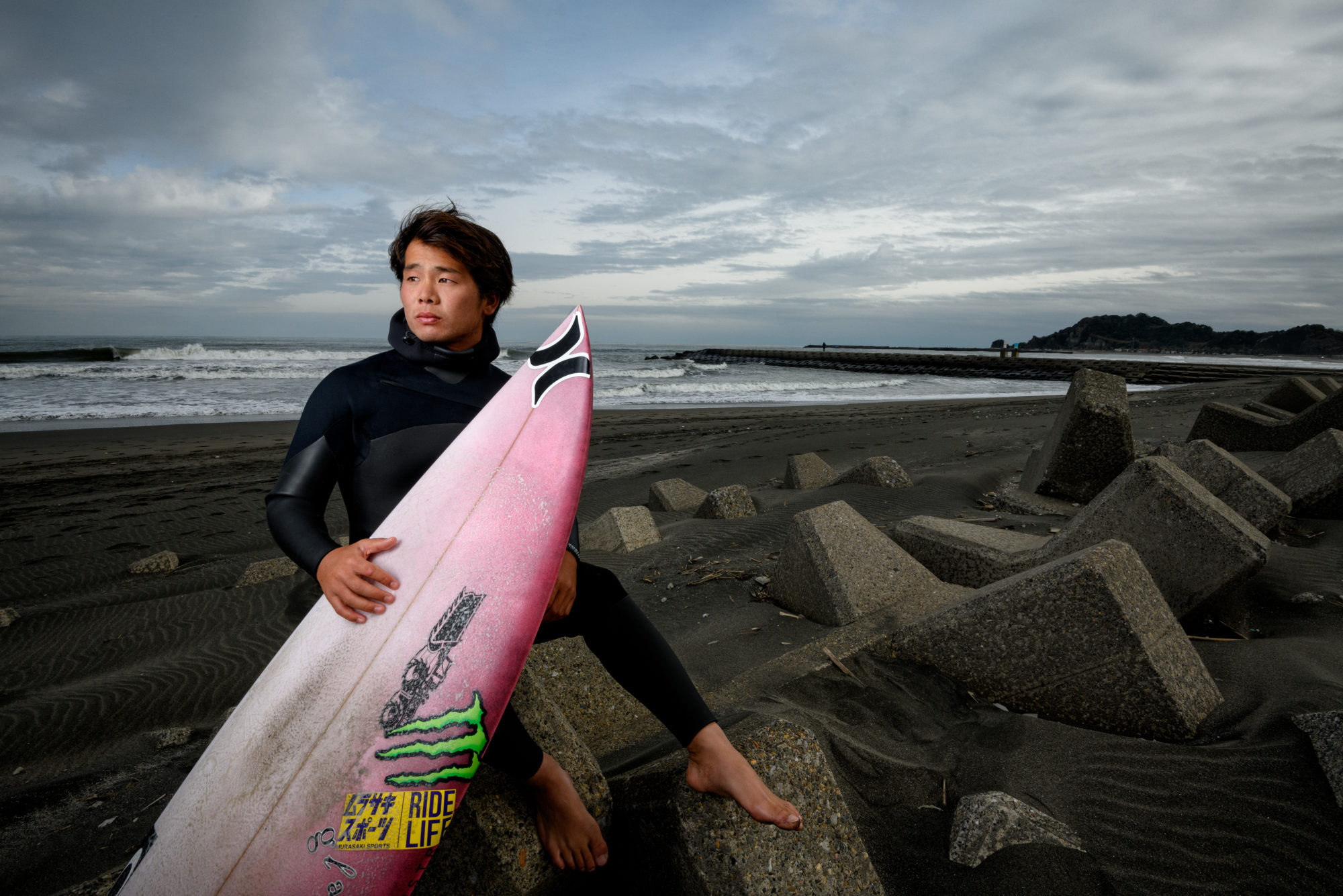
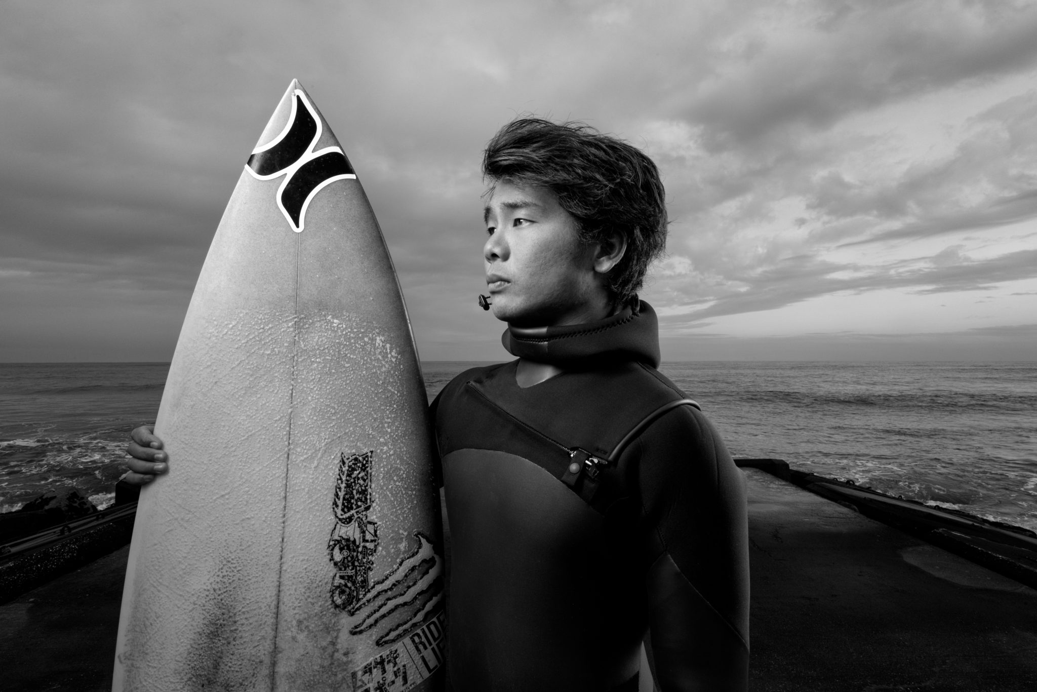
To be honest, these are the rare examples of photos that look as good in black and white as they do in color. There’s enough contrast that they read well in monochrome without the need for color to take over, but the colors look good. My eye tends to be drawn towards color images, so if I were a picture buyer I’d go for the color versions.
Joe. You are the consummate “We-Go” Pro. Always an inspiration. Thank You.
B&W vs. colour is often a tough call, because colour can Be a subject unto itself. With a lot of Eric Meola’s work (for example) colour IS the subject.
In these three images the grayscale versions offer a more gritty view of the scene, but the colours are so muted overall that I think the splash of vitality to an otherwise mostly monochrome day.
YMMV!!
Hugs,
M&M
Spot on, Mike….Eric and I went to Syracuse U, same photo program, though he was a few years ahead of me. Great shooter….all best and thanks!
Very kind words…much appreciated Jeff….thanks as always for stopping by the blog.
Cool, good perspective. The board is a graphic and colorful item, so my tendency is to lean into the color as well….
Of course I love anything you do! I tend to lean towards color but I like both! Take care and stay safe!
Your question on black and white for clouds goes both ways for me. Sometimes you can get some pretty insane blues behind and through the openings which make for some interesting background. With out those blues though, I would have to agree with the black and white approach. Hang ten Joe, enjoy your times!
les noir et blanc plus fortes
I like both color and black and white, I also agree about the graphic aspect of the board, that’s maybe why I’d go color 1 and 3 and number two, since there are no that much graphics, black and white.
The color of the board stands out so much in a monochromatic setting that it almost becomes the subject so I’d vote for b&w
Joe, I love your black and whites, but for these I love the color ones. 🙂 Anything you do is going to be outstanding. Best Light, and please keep the posts coming. I love traveling vicariously with you.
I tend to “see more” in the B&W renderings and they get my vote. Personally, I love anything produced by Joe McNally, the master!
Very kind, Jim….thanks for taking a look. B&W is so beautifully durable.