Another in a continuing set of blogs, parsing out a current National Geographic story on UAVs published in the March issue.
The way it was shot….
 copy")
The way it ran…

When I tell some folks, who might be just starting to shoot jobs for money, that a client like Nat Geo sees every frame I shoot, they tend to blanche a bit. Every frame? Like, even the ones you don’t retouch?
Yep, good bad or indifferent, every frame goes to the magazine. Was like that in film days, and remains true now. (I say this as being a general rule of engagement with the yellow border gang, without knowing if some isolated photogs out there have a special arrangement with them. That could be possible.) But, for the workaday shooter in the employ of the magazine, you shoot it and ship it.
Which means of course the raw file. No PhotoShop, no retouching. The pix drop out of the camera onto a hard drive and thence into a FedEx package and onto 17th and M in DC. Most of your images are in fact like a stone you drop down a well. There’s a long period of silence, then a distant splash as they vanish from sight forever. Sometimes though, quite wonderfully, they don’t just drop unceremoniously out of the camera. Some actually strut outta your picture machine like a Vegas showgirl in full plumage, resplendent in seductive stilettos and fishnets, and all so sparkly and spangly they utterly bedazzle the bespectacled editors at the Geographic, who, I suspect, are a group who don’t get out much. They win their audition in stylish fashion, and thus gain entry, in all their colorful glory, onto the pages of the magazine. That happens to a rare few, actually.
But honestly, “dropping out of the camera” is a good description for most of your efforts. Thud! Mine in particular often bear a rough similarity to a bunch of rapid fire rabbit turds. There’s a bunch of them, they smell bad, and they get left behind.
They get left behind for good reasons, of course. The astute picture editors at Geographic are a pretty visually jaded bunch, having had many wonderfully stirring images pass their eyeballs. I can only imagine what goes through their heads as they plow through a take. (“Christ, another beautiful sunset. What was this asshole thinking?”) They seek only those images which impart difference and information in a truly distinctive way. If it’s just plain pretty, it generally closes out of town.
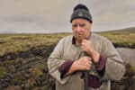
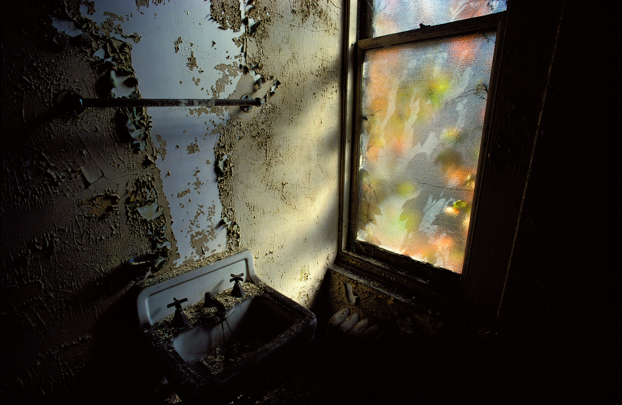
I thought I might have had one of those rare, meritorious, worthy of ink images with the frame atop the blog. It features one of the ” 50 best inventions of the year,” the Nano hummingbird, which flies and hovers just like a hummingbird and bears a video camera onboard. It is in the class of mini UAVs that are currently being experimented with and developed. The inventor, Matt Keenan, of AeroVironment, is a pretty brilliant guy, so, I thought, let’s get him with the machine. That was harder than you might expect.
Here’s the basics. It’s a programmed double exposure on a D3X. In brief, it’s got two small flash exposures, operating on different channels, during each exposure, a pair of LED lights attached to the bird (my suggestion), and a focus shift in between those exposures. First exposure was at a fast shutter speed. Second exposure was on bulb.

First exposure: A channel one deal, with a 24″ softbox on the Matt’s face, and then various hard flash splashed around the warehouse room to establish some sort of depth and context. These have various gels, and there is an ungelled flash rimming him. Shutter speed, 1/250 of a second. Didn’t want any cracks or slivers of light in the big room to bleed into the photograph. For the subject, he simply has to stand there, and look at the camera, UAV controller in hand.
Second exposure: On the same piece of, uh, film. Change channels on the commander to two. Two speed lights rigged to light the little birdie off to camera right. A main and a backlight. The hummingbird, LEDs alight, takes off from the inventor’s feet, and flies in its herky jerky way over to semi-hover in front of the camera lens. Focus has been shifted from the human to the bird. Click. Camera processes double exposure. Check LCD. Re-do. Digital definitely facilitated this. If I had to shoot this on film, I’d still be there. Each flight was between 5 to 10 seconds, and the LEDs carve a pattern in the blackness.
Here’s Cali and Drew in position for lighting purposes, with Drew doing his best hummingbird imitation.


Of course, the hummingbird we worked with was a singular prototype, so we were lucky to get a picture at all, and the thing didn’t break. And, being a prototype, its flight path, as you can see above, was on the unpredictable side. (It has evidently made great strides since this time in terms of endurance and precision of flight.) And of course, yours truly just flat out missed it a couple of times, as it buzzed its way past my ear.
But we got the deal done, and shipped it, un-retouched to the mag. It ran, as I hoped it would, but only as, really, the second exposure. In the published version, the focus is on the bird, not the inventor. Which is okay by me. Once you surrender a picture to a magazine, it is under their purview, not yours.
So….here’s your chance to art direct a bit. Cropped version? Uncropped version? Which do you prefer? Which tells the story better?
More tk….


Uncropped. Just the presence of the human makes me wonder and want to read more. Just my opinion of course.
Uncropped version for preference. For me the product is in development and needs the context of the inventor. Though I can see why they did the crop for placement on the page with the explanation bar. Fitting the image to the design format rather than seeing the image as shot.
First, I have to say that you are every bit as good a writer as you are a photographer. And you’re a great photographer.
I would prefer no crop, but that may be a product of me being me.
For me as the photographer, I would have to take the POV that you have — they don’t pay me to edit, they pay me to shoot. Its their mag. For me, the key to this is the fact that unlike so many other people in this world, the Nat Geo editors DO know a good photo when they see it.
WeLl done, BTW, as always.
Humm, amateur photographer responding to a blog by McNally… it’s with a bit of trepidation that I open my mouth.
I’m intrigued by the questions, and it boils down to a question of my own, “which story?”…
When I’m looking at the uncropped version, the story I get is that it’s about this inventor that has made this cool hummingbird gadget, and the focus of the story is more on the inventor.
When I’m looking at the cropped version, the story I get is that we’re looking at a cool flying gadget, and this might be something about these cool gadgets, the focus is more on the things, perhaps the technology, perhaps the use of them.
As I understand the article (I haven’t read it at all, mind you, just what’s in the text of the cropped variant), it seems to talk about different types of spy drones, perhaps cloaked or disguised in various ways, and the hummingbird is the example in this article. As such, and the stories I get from the two variants, it seems to me that the cropped version is more appropriate for that kind of story.
As for which one I like best, it’s hard for me to say. Photographically, I get a little disturbed by the obvious shadow from the inventor in the cropped version… but still.
Uncropped. Especially since the weight of the picture seem to balance more with the inventor to the left and the hummingbird flying of into oblivion to the right.
I dont really get the focus part, to me it´s equally important to show both even though the article seem to focus more on the bird itself.
That´s my two cents.
As a photograph in a vacuum, the uncropped version is better. But when put into context (a double truck magazine spread), I’ve got to agree with the editorial decision to crop it. Here’s why:
1. The most compelling light trails in the original version would have fallen in the fold – the cropped version places the fold into the most mundane segment of light trail.
2. Th decision to place the “schematic” drawings on the outside edge of the right page makes a lot of sense as this will probably get people who are merely “page flipping” to stop and open the spread. Since the aspect ratio of the original mage didn’t have any excess image space top or bottom, the best solution is to shift the image to the left.
3. If the editorial focus of the story is about the devices, then the inventor of the device becomes less relevant to illustrating the story.
Cropped…not even a question. The title (and thus, the focus) of the piece is “The Drones Come Home.” Drones are interesting for the sole reason that they function quasi-independently of humans. Although we know that there is always a man behind the curtain, the spectacle is almost always more appealing if we never notice the MBC (kind of like Joe’s philosophy about flash–when it’s not calling attention to itself then it’s perfect).
uncropped – they need to get out more
“like a Vegas show girl” – love it!
I think it all depends on the context of the story. Of it is about the technology, then the Nat Geo crop makes sense. If the article is about the inventor and the development of the tech, then the “as shot” crop makes more sense.
I think both ways work, just in differing context.
Proof that images can be edited in countless ways.
In my eyes, if we are looking only at the photographs. The Uncropped version is better. It has more meaning, more story, it tells us about the invention and what it does and who created. There is a human factor and also shows a connection between the object and how it is controlled.
If the story is only about the object then I can see why they cropped. Gives them more room for copy, it is a cleaner photo to use on a magazine and just saying that it is controlled by radio is a lot smaller than having the rest of the picture there.
That’s my take on it….
Wooow this is great photos… Like it
both are amazing. the cropped version has more mystery for me, and triggers different questions. having the guy in the frame makes me think more about the dynamic between him and the bird/robot vs. more generalized ethical questions about drones, etc.
interesting and mind blowing to think about how you nailed this photo.
thanks for sharing!
Uncropped, I agree with the first paragraph from Camere Photography, above. No question. The uncropped version has much more depth of information and meaning. When I saw the cropped verion in a previous post I had to look to it for a minute to see what it was. Now that I see the uncropped, the image speaks to me.
I have taken a bunch of courses from a certain photog who has brainwashed me into thinking that images witout people can be OK, but add a human to the mix and a whole new dynamic is possible. 🙂
Nice writeup, Joe – it’s eye-opening to hear all the bts details that you end up dealing with.
The uncropped version should have ran. The inventor is every bit a part of the story. Seeing his shadow in the cropped version leaves you with the impression that something is missing that should really be included.
Nicely shot, though (as usual).
I believe I’d have to read the story first to make a good decision. However, as far as photos are concerned, I really like the uncropped version best because for me, it adds another element to the story, gives a sense of size and perspective of the drone, and also relates that one is not capable without the other.
That, and I think the uncropped version is just a kickass picture!
To me, the inventor is as much a part of the story as the hummingbird so I vote for the uncropped version.
Of course the uncropped version in a masterpiece!!!
All joking aside:) I believe the editorial choice puts more emphasis on the drone itself. Richard’s earlier comment says it all but the proof for this theory lies in the fact that all that real estate taken up by the inventor was then given over to the UAV graphics.
Aside from this there could also be security reasons why this gentleman wasn’t featured.
I personally am always attached to the people I meet on shoots and feel a sense of duty and obligation to tell their stories. That’s why I follow you Joe! You rock dude!
Thanks for the inspiration!
It goes without saying that the uncropped version is a masterpiece!
All joking aside:)…
The editorial choice clearly emphasizes the Drones as the character. Proof to this theory is evident in all that real estate, saved by cropping out the inventor, being handed unceremoniously over to the graphics on the right margin.
Seems a shame to waste a perfectly good white boy like that but I get why.
as a layout designer for a magazine, I agree with the editorial choice: the cropped version has a great visual impact and balance. I love the way you captured the whole scene, so I agree that as a photo on its own it tells a better story uncropped, but for the editorial, cropped works better for me!
My preference would be to maintain the human element.
for me, both are usable, valid images. they both tell a story, equally interesting. but the uncropped one is my choice: the cropped version makes the shadow of the inventor a nonsense, imho. Hi Joe! 😀
Uncropped. Period.
For the magazine, I agree with the cropped version because I feel like it’s a stronger image. Unless the article is on the inventor, I think the person in the frame is a little distracting especially when you think about also adding copy to the page and it would have made the bird significantly smaller on the page.
Unwrapped – the drones aren’t autonomous, and this image as you shot it keeps that (if you’ll pardon the expression) in focus.
I prefer the uncropped shot. The story is on drones but that also has to include the human research and development that goes into creating a machine that mimics something organic. A pretty remarkable piece of engineering and in the original shot it’s nice to see the inventor for A) recogition of his efforts, and B) the look that says “Please don’t crash”.
Besides, by not including the first capture – millions of photons died needlessly.
Sorry. Cropped. Heading now to my secret undisclosed location before Joe sends out his flying monkeys….
no crop. the shadow left from the male on the cropped version creates an “pull” towards the bottom of the shot.
Uncropped, definitely. The man’s presence brings in more mystery to the whole picture.
Both are interesting images. From the editor’s / story’s standpoint, perhaps if the perspective was slightly different – having the “hummingbird” right next to Matt’s head – in order to emphasize just how small these drones have become? Not that I’m in any position to criticize any of Joe’s compositions, just sayin’…
I prefer the cropped version, except for one thing. The obvious shadow of the inventor in the cropped image leaves me scratching my head and wondering what’s going on there.
Of course, if the intent of the image hadn’t been to have the inventor in it, then that shadow would be there anyway.
The uncropped picture tells the viewer about the bird and its operator – it answers a question. The cropped version asks a question – it makes the viewer think. Much more interesting; the Magazine made the right choice.
I like them both. The story that goes with them is good too. As Joe pointed out, to get to print a photo has to be beautiful and it also has to move the story along.
In “uncropped”, the star of the photo is flying out the right side of the frame and there is some guy, standing in shadows on the left thirds line, wearing a black shirt and black pants with only half his face lit.
In “cropped”, someone has made use of the dark box behind the hummingbird to almost seamlessly extend the right side of the frame and add in the graphics. Magically, the hummingbird is now sitting on the upper right intersection of thirds lines — most powerful of the four power points. And, it has somewhere to fly toward in the frame.
Brilliant photography meets brilliant editing!
I am a bit surprised that a double exposure is allowed in photojournalism.
Uncropped — even though the drone is the character, including its inventor would have emphasized the (tiny) scale of his creation.
Uncropped. It is sort of hard to see the drone. The article is about how they are growing in use, and they need someone to make them and fly them. I think it better tells the story but I know the editorial department needs to put text somewhere, and it might compete with the person. But in my mind, uncropped is stronger.
Bill Bogle, Jr.
Cropped, since the article is about drones and related technologies. But…the beauty is that Joe gave the editors (at least) 2 images which allowed them to choose which image best suited the story. To me, that adds value to having Joe shoot for them: NatGeo will get more than they asked for; they’ll get enough images to create the best article they can. They could also have used the photo of the inventor on its own, although they chose not to do that. Great thinking and great customer service Joe!
Hey gang…to all the commentators. Many thanks for inputting. This is fun, and very informative to hear everybody’s opinions and the why’s and wherefore’s of those opinions. Very cool….many thanks for stopping by! Joe
I join those voting for your original uncropped shot. I thought the point of drones was or is the gamers who can use the joysticks to point lasers on targets. Ergo: a guy and his un-personed drone. Nice shot.
That aside, your self-deprecating droll writing makes me grin: “Mine in particular often bear a rough similarity to a bunch of rapid fire rabbit turds.”
Precisely. That’s why you’re where you are, and I’m not.
Uncropped. Context and subject are important and greatly illustrated with the inclusion of the guy to the left.
Uncropped for me too. Having the creator/pilot in the shot not only balances the image better to me but also links the human side with the drone – and hopefully indicates that we are still required in the equation.
I like the cropped version, and going against the flow, I particularly like the shadow of the inventor. That’s kind of a point with UAV’s – Nobody knows who or where that shadowy UAV operator is.
Cropped. Way more impact and gets you wondering, “How do they do that?”. I see the controller as an unnecessary element.
Cropped. Is a more powerful image. With a good title will carry you to the drones, this devices that are managed by people that you are not able to see. But if the question was about the last picture you published I would said uncropped cause this image can’t be cropped without damage the photo. By the way, how you measure the exposure of the last drone to get the trace of the little lights?
Uncropped version – but on the plus side, at least they just cropped it and they didn’t Photoshop the inventor out!
Uncropped for me, but I can see why the yellow border police cropped, more impact on the DPS and room for the graphics etc on the right. As usual Joe, great images and thanks for sharing.
Hi Joe,
I found your comment on all the images good and bad go to the publisher amazing. I would never think to question you and I am sure you give the client what they want. But are you not concerned that an image that does not come up to your personal standards get released and bi-lined a Joe McNally Photograph. I actually ran into this with a client that wanted all the images that I shot. Then one was posted that was an embarrassment to me but out of my control at that point. Clients assume that every time we push the shutter button the result is magic. I for one am lucky if I have one shot that is magic in a session. But all of them? Well, I am a far way from that point. Take care, hope to see you again in one of your training sessions. Your friend Mike.
Cropped. Somehow the cooling fan shadows are not drawing my eye so much.
In-camera double and multiple exposures are of great interest to me (one of the reasons why I switched from the Canon 5D to Nikon D700). Some folks say to just use photoshop. I dig that too but in this case, due to “the rules”, you had to get it in-camera.
Until your question regarding cropped or uncropped, I hadn’t realized that there are two equal subjects in the photo, because it’s actually two photos of two different subjects, and they tend to compete for the viewer’s attention.
In that regard, I’m thinking that they got it right. But still….
I know this is like an alter boy correcting the pope, who ever that is, but I think it should have cropped to 1 pixel . Yuke, but you are worthy of better projects
ken
I liked your original better, with the designer in the background. But without it, it really emphasizes the concept, even if not entirely accurate, of “unmanned”.
The “better” image depends on the article. Was the article about drones and UAVs? If so, the editors made the right call. If the article was about inventors, then the full frame image would be best.
Besides a double exposure is not playing by the “rules.” A bulb setting and two flashes would be fine, but trick photography is not what makes NatGeo great.
No … I am shocked to say this (We are talking about NATIONAL GEOGRAPHIC), but I feel the “better” images is with the “human element”. These are, lest we forget, controlled by a human — somewhere, somehow.
So much so, that the military even came up with a medal for such a thing …
Drones/Humans … the complete story.
The image doesn’t connect the man to the hummingbird. I don’t recognize him and can’t see what is in his hands. So, Nat Geo made the proper crop.
Umm..sorry…but BOTH are poor choices. The one with the guy is too busy – and the shadows of the window fans are dead center, and the drone’s almost at the edge. It’s too cluttered, and what the hell are the window fan shadows doing there anyway? You LIT those? 🙂 In the cut version, the gol-dang hummingbird/drone looks like Frankenstein’s monster, stumbling along with his arms straight out. Yikes! A zombie bird! “Hiding in plain sight” it’s not. A great concept, but it needs a reshoot. The flight pattern of the LED’s is cool though.
All photography is “trick” photography. The point is to use subtle, honest tricks. These are honest ones, I believe: they show the potential of tiny drones, and also what still needs some work. The “subtle” part still needs some work though…
Ok, do I sound cranky enough to get the job?
Christ you sound cranky enough to be an editor at the National Geographic….:-)
The way you shot it was the better shot. It makes the connection between unmanned aerial vehicle that a targett may or may not see and the “man” controlling it that absolutely will not be seen. Cropped version just shows me it flys.
I vote for cropped for the magazine, and uncropped if it appears later, in a book or somewhere. It reminds me of Eddie Adams’ 1969 Pulitzer winning photo from Vietnam. The cropped version was the best choice at the time for news organizations, but now I feel cheated if I don’t see the entire frame, which, thankfully, is how it appears most often.
The uncropped photo is clearly a better composition, and it’s rightly placed here on a photography site.
However, National Geographic is a magazine. Its editors have to blend together text, photos, and infographics/diagrams/cartography in a way that will grab peoples attention and allow them to learn about the subject of the article. That introduces a few factors in favor of the crop:
– They needed space around the image to fit in text and the extra diagrams and information to explain what the image means. The photo urges you on to want to learn more, and that desire has to be satisfied. On its own, this picture gets 100% for visual impact, and about 5% for hard information about the subject.
– They wanted attention on the technology and not on its designer/controller, as that’s what the article was about.
– Politics might have come into it. There’s a lot of opposition to drones, and much of it centers on the humans operating them. Privacy concerns might often be rooted in people’s distaste at the drone operator being able to spy on them, not the drone itself. By showing the tech without the people, they’re focusing attention in a particular way. So Joe – as a Nat Geo photographer, you get to take pictures of prototype drones and astronauts in training and the latest Air Force jets. If the magazine’s editorial line shifts against the agencies involved, that access might start getting a lot harder. It’s the stress that makes them cranky up at 17th and M.
One technical thing – I’m surprised at the decision to blend the two exposures in camera, as it seems like a throwback to film days. If you’d submitted them as two separate shots then the editors could slap them together in 8 seconds in photoshop, or use the pure drone image if they wanted to. That would also make it easier to take a sheaf of images for each of the two exposures and then have the freedom to pick which two to composite (if they’d wanted to go that way), with different options for drone and for inventor + background. What’s the point in submitting a double exposure?
Thomas Alba Edison? Who´s that guy?.. nooo, no, no crop the photo and let the light bulb alone…. looks nicer….. :).